The Solution
Dhaaga is a fashion website targeted towards providing users with the opportunity to buy high end fashion products, as well as provide the user with options to choose a career with Dhaaga.

Dhaaga is a responsive full fledged fashion and retail website, that I designed and coded from scratch. This was part of a hackathon conducted by my previous employer, Deloitte US-India. The website offers a unique and
I was involved in the research, low fidelity designs and development of the website. I user HTML5, CSS3, JavaScript and jQuery to develop the websites.
My Role:
User Research, Interaction, Visual design, Development
Duration:
October 2018: Hackathon
Team
Vaishnav, Varun, Akhil, Shreya, Yash
Dhaaga is a fashion website targeted towards providing users with the opportunity to buy high end fashion products, as well as provide the user with options to choose a career with Dhaaga.

1. Landing Page
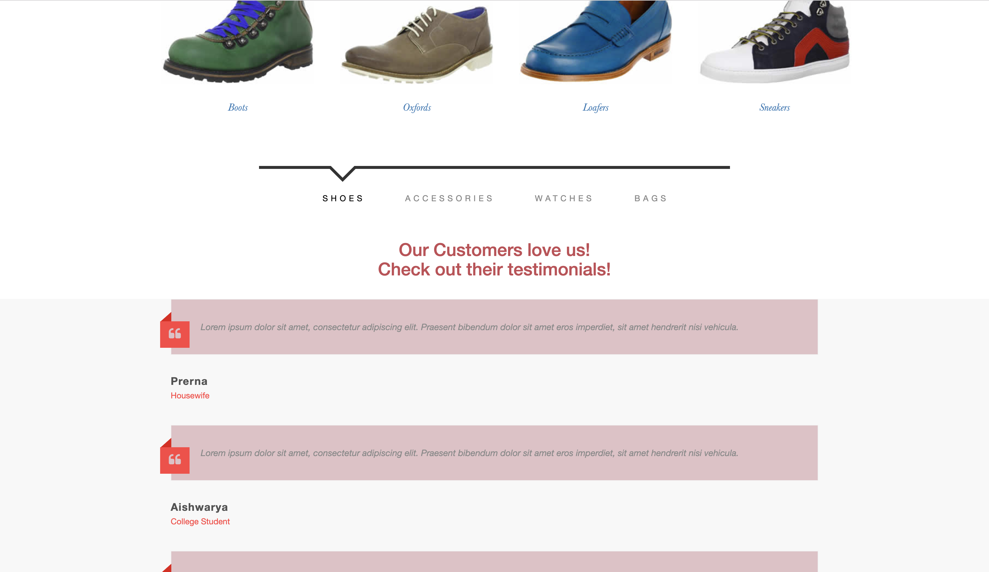
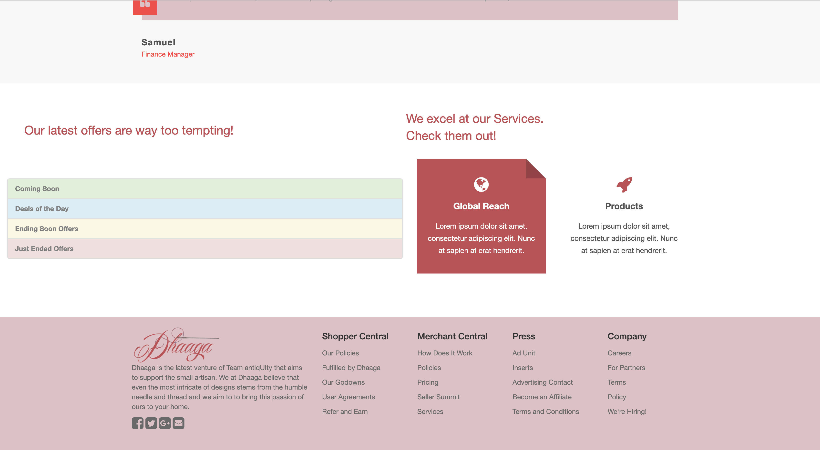
The landing page features the latest collection in the boutique, along with top products that the customers can purchase and check out. As you scroll down, the page features customer testimonials. At the bottom, the page features latest offerings and our services.
2. Womens/Mens clothing page
This page is a like an e-commerce pages, which shows the users options to add items in their cart. The page also allows the user to click on any item which takes them to the details of the item
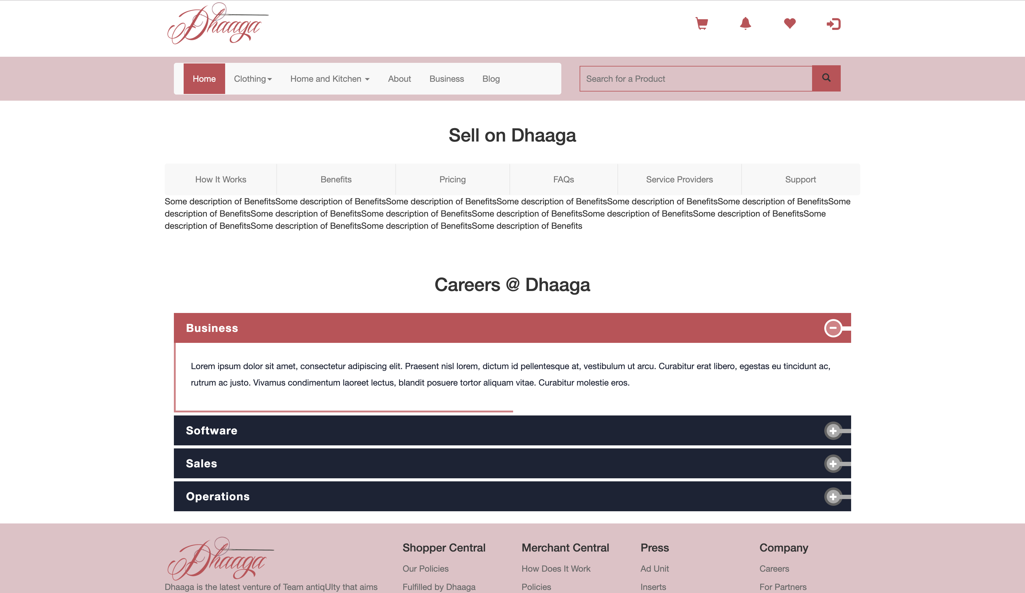
3. Business Page
4. Blog
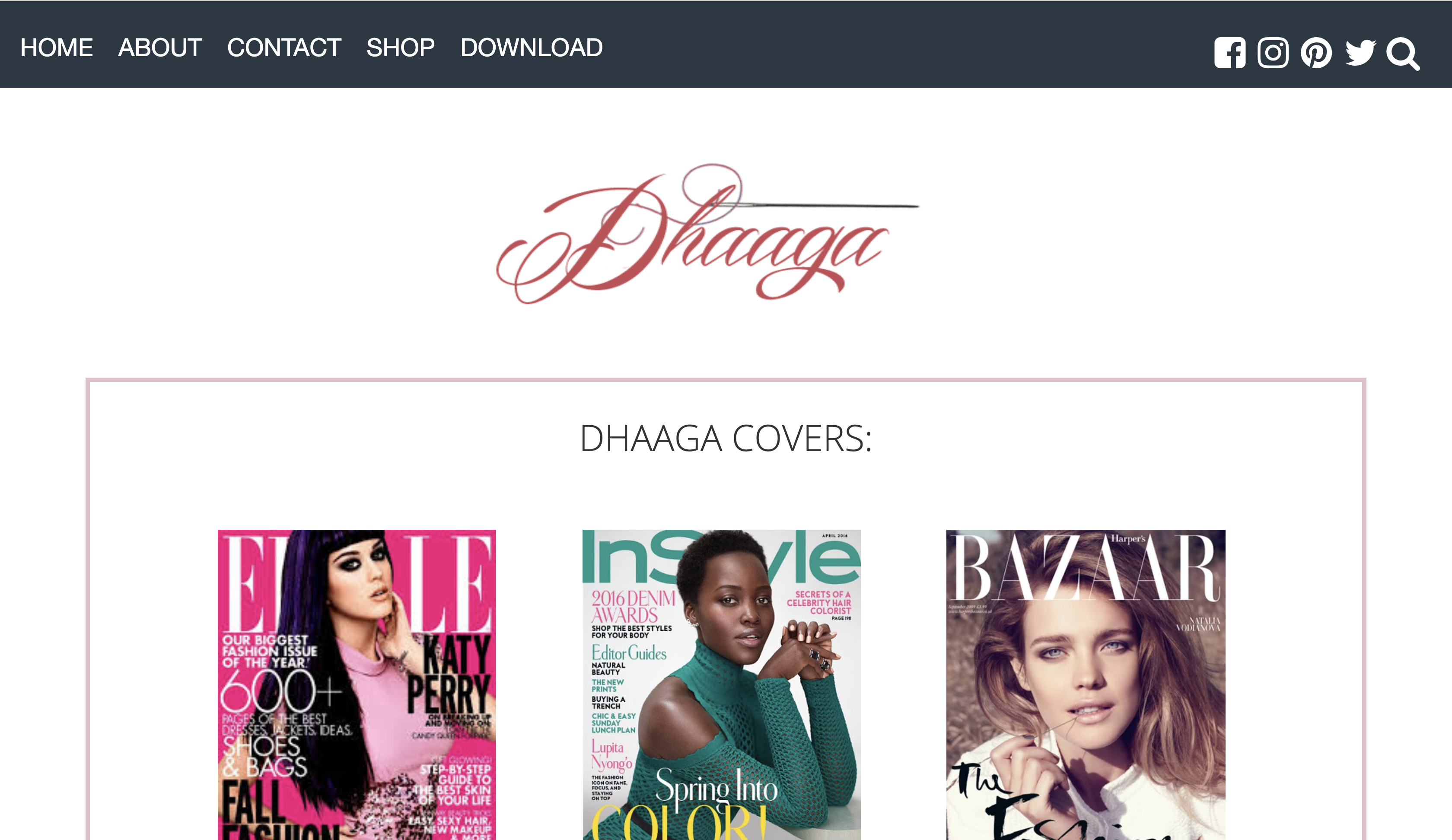
The blog for Dhaaga has links for the latest fashion magazines. THe blog also shows the numer of customers and stores Dhaaga has, amongst other things. The blog page functions as a visual and aesthetic retreat for the user from the main e-commerce website, and offers the user a unique peek into the world of fashion, and how Dhaaga is deeply woven in it.
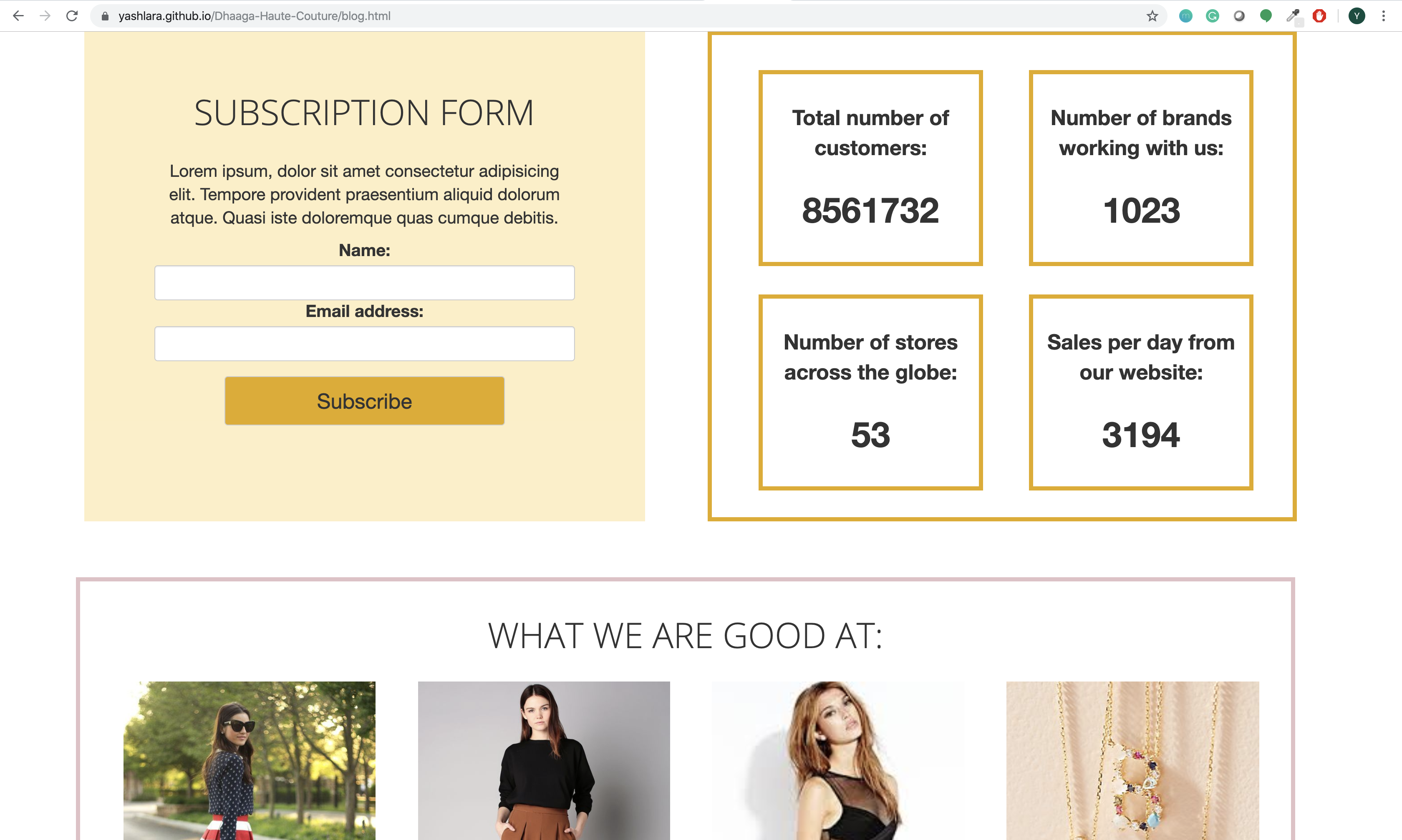
The website has been branded especially for people who like fine and aesthetic clothing. The User Interface branding especially caters towards a more esoteric population that is interested in haute couture and high fashion.
I conducted surveys and interviewed 20 users. I asked base questions about their experience with existing e-commerce website, and what changes they would want in it. I also asked about what additional features they would like to see in the new website.
20 users were selected on the basis of their experience with e-commerce and e-fashion websites.
1. How much experience do you have with e-fashion web applications?
2. Can you list the e-fashion and e-commerce websites you are currently using.
3. What features do you use the most in these websites.
4. What are the major problems faced?
5.What aspects and elements would you like to see differenly in these applications?
6. What additional features would you like to see in an e-fashion website?
Surveys were conducted to get a preliminary understanding of the suers perspectives in regards to e-fashion websites. THe surveys gathered responses about which all web applications the users are currently using, for what they use the application, and if they have any frustrations with these applications.
1. Existing e-fashion websites are not very easy to navigate.
3. The UI for these websites are too cluttered; too many tiles in the same page.
2. Most webistes do not evoke any feelings of warmth or empathy in the user.
4. Users want to see more about fashion in general than just products for sale on the website.

As we moved on to designing the interface of the application, I wireframed all the UI screens. Shown below are the low fidelity prototypes, done using Balsamiq.
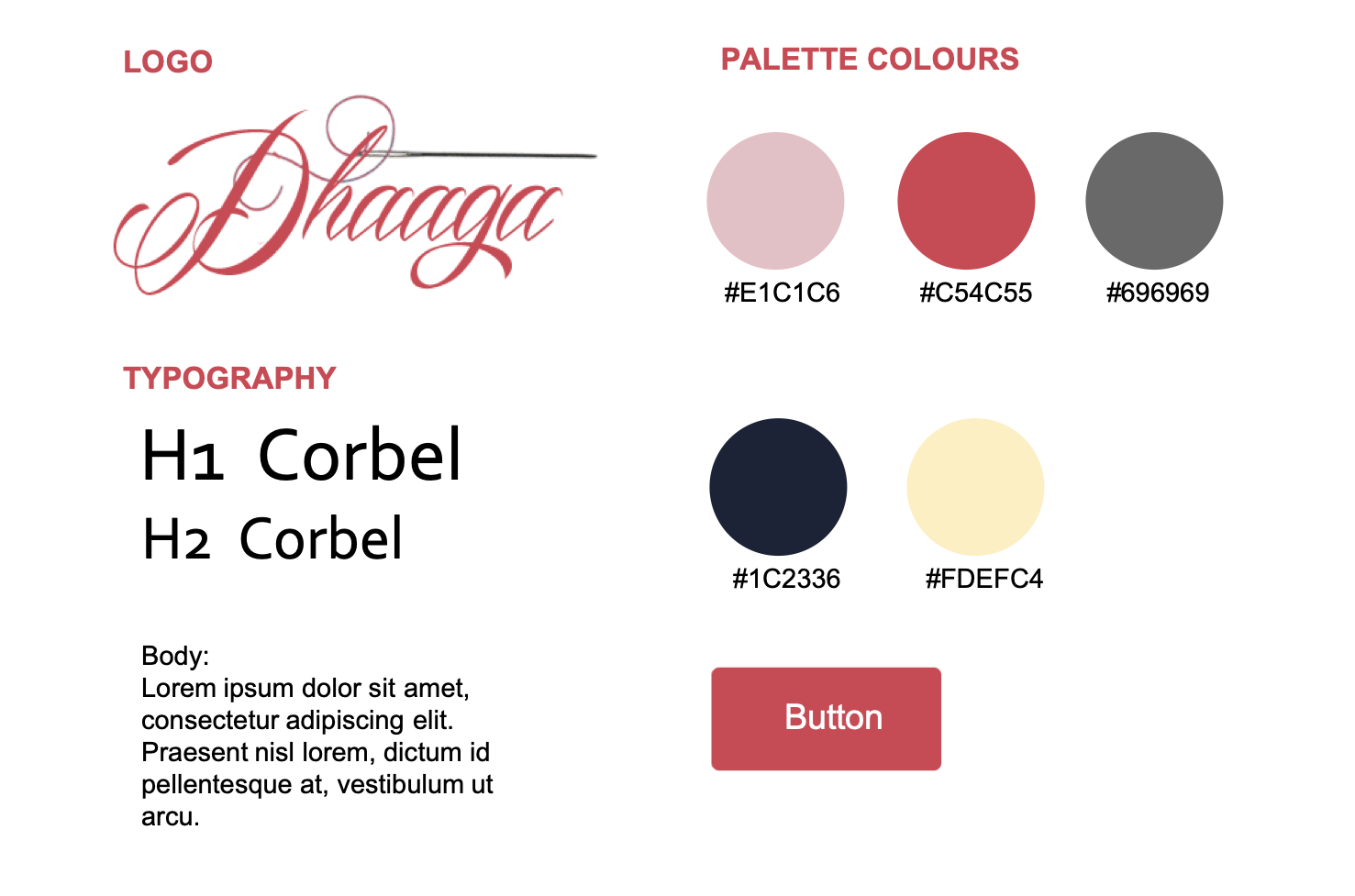
Designing and developing Dhaaga helped me learn a lot about user research, UX design and Front End Development. Through constant iteration and feedback, I gained valuable skills in HTML, CSS, Javascript and jQuery.
Dhaaga received great reviews in the Hackathon and was applauded by the judges for its interface and visual design. I was awarded the consolation prize in the Deloitte Hackathon for Dhaaga.
Points which are not covered in this case study but could be worth discussing in person:
Thanks for making this far. Here's a gif for you.
Have any suggestion or interested in working together on a project?
Go ahead, I'd love to connect with you.
© Designed & Coded by Yash Lara.